Previous Next

Task 3: 

In task one, you created the data source connection and data set that you need. After selecting the data set to use, you must set up the expressions that the chart uses to represent the data graphically. Each type of chart uses data differently. For a pie chart, you must select data expressions that specify

n
The data values represented by sectors in the pie. In this tutorial, you use an expression that creates one sector for each product line value.
n

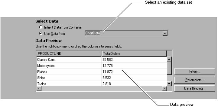
You can use different techniques to provide a data expression in a chart. The easiest way to specify the data to use is to drag a column from Data Preview to a field. You can also type the expression or use expression builder to create an expression.

1

Figure 14-5 Previewing the chart in the upper section of Select Data

Figure 14‑5
Chart Preview displays a rough sketch of the chart for design purposes. For example, if you change the color of the pie chart sectors or replace the default title text with a new title, Chart Preview reflects your changes.
The final published version looks more elaborate and complete, particularly if you choose to use live data for previews. In Chart Preview, the chart builder uses either live data from your data set or randomly generated sample data, depending on how you have set the Enable Live Preview preference.
2
This report file includes only one data set. Select ChartData from the drop‑down list.

Figure 14-6 Selecting the data set in the lower section of Select Data

Figure 14‑6
In the lower half of the chart builder, Data Preview displays some of the data from the data set that you are using. You can see the product line and total orders columns. By default, Data Preview shows six data rows.
3
First, to determine which sectors the pie chart displays, you provide a category definition. In Data Preview, select the PRODUCTLINE column heading, and drag it to the empty field to the right of Category Definition, as shown in Figure 14‑7.

Figure 14-7 Supplying a category series expression

Figure 14‑7
The following expression appears in Category Definition:
row["PRODUCTLINE"]
4
To set the size of each sector, select the TotalOrders column header, and drag it to the empty field in Slice Size Definition, as shown in Figure 14‑8.

Figure 14-8 Supplying a value series expression

Figure 14‑8
The following expression appears in Slice Size Definition:
row["TOTALORDERS"]
In Data Preview, the total orders column now appears colored to indicate that the column is used in the chart. The image in Chart Preview also changes to use the data you specified. The product lines have become the chart categories. Each sector represents one product line. The size of each sector represents the total orders for that product-line category.

(c) Copyright Actuate Corporation 2009